Jun 19, 2026-Reviews
DATA HIT Tools Review - Patterns Your Line Charts Miss
We've tested DATA HIT Tools, a free suite of four visualisers for GA4, Search Console, Google SERPs, and AI engines that surface the patterns dashboards flatten.
Welcome to this DATA HIT Tools (tools.datahit.co) review ✨
Most analytics tools give you the same thing: a line going up, a line going down, a number with a little arrow next to it. They're great at telling you what happened last week. They're terrible at showing you the shape of a year, the rhythm of a week, or which competitor quietly took over your keyword every November.
DATA HIT Tools goes after exactly that gap. Its tagline says it plainly: "Patterns line charts miss." It's a free suite of four visualisers spread across GA4, Search Console, Google SERPs, and AI engines, each one designed to expose a pattern a regular dashboard flattens into nothing.
I spent some time putting all four tools through their paces, connected my own Google accounts, and tested the Pro tier too. In this review I'll walk through each tool, what it's genuinely good for, the Pro features, what it costs, and who should bother.
Getting Started & First Impressions
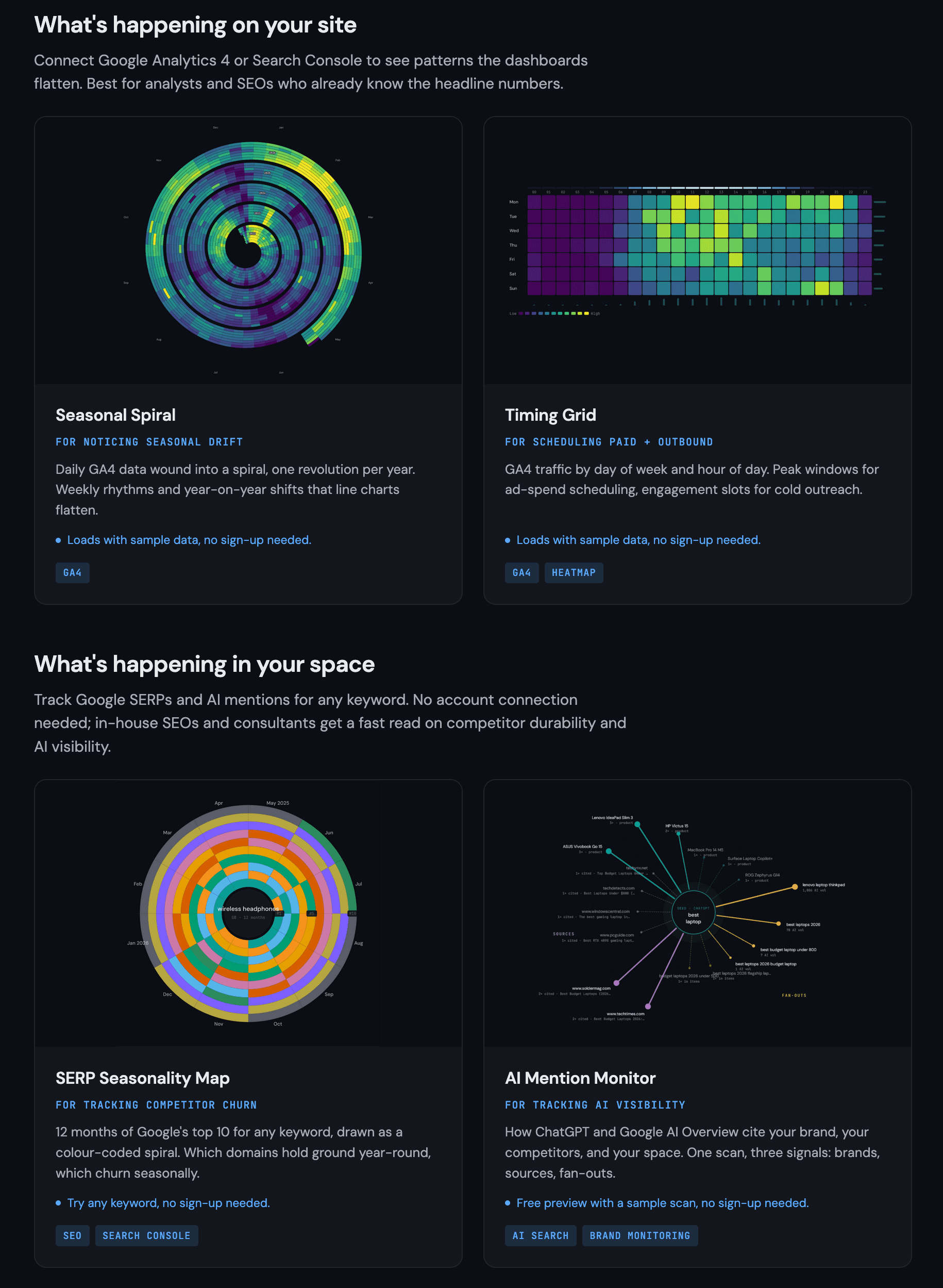
The first thing that struck me is how the suite is framed. Instead of "here are four tools," DATA HIT splits them into two questions: what's happening on your site (GA4 + Search Console) and what's happening in your space (Google SERPs + AI engines). That framing immediately tells you which tool to reach for.
There's a privacy detail worth calling out early: each tool runs in your browser, and your raw data never touches their servers. For anyone nervous about piping client analytics through a third party, that's reassuring.
Three of the four tools work instantly with zero friction. Seasonal Spiral and Timing Grid load with sample data so you can play before connecting anything, and the SERP Seasonality Map runs on any keyword with no login at all. Signing up is free, and once you're in, you can connect your GA4 and Search Console properties from the dashboard to chart your own data.
The Tools
Seasonal Spiral: for noticing seasonal drift
This is the tool that gives the suite its visual signature. It takes your daily GA4 (or Search Console) data and winds it into a spiral, one full revolution per year. The result is that weekly rhythms and year-on-year shifts that a flat line chart smears together suddenly pop out as concentric rings.

You can chart sessions, transactions, revenue, or event count, switch between colour scales (Viridis, Warm, Cool), and choose how outliers are handled (linear, percentile, or logarithmic). There's also a year-on-year mode that puts two years side by side. Below the spiral it surfaces the useful headline stats automatically: daily average, peak day, busiest weekday, and the number of days shown after filters.
It's genuinely the kind of view that makes you go "huh, I didn't realise that was a pattern." A line chart will tell you December was big; the spiral shows you whether December is always big.
Timing Grid: for scheduling paid + outbound
Timing Grid answers a much more tactical question: when, exactly, is my audience active? It plots GA4 traffic as a heatmap of day of week × hour of day (a 7×24 grid of 168 cells), so peak windows and dead zones jump straight out.

The practical payoff is twofold. If you're buying ads, the grid tells you the hours worth concentrating spend on. If you're doing cold outreach, it flags the slots where engagement (not just volume) is highest. In the sample data, the busiest hour and the most engaged hour weren't the same, which is exactly the kind of nuance that matters for outbound. Quick toggles let you isolate "Peak traffic" or "High engagement" cells, and the summary cards call out the single peak slot, busiest hour, and top engagement window.
SERP Seasonality Map: for tracking competitor churn
Now we cross over to "what's happening in your space," and this one is my favourite. Enter any keyword, pick one of 11 countries, and it draws up to 12 months of Google's top 10 as a colour-coded spiral, one band per domain. Popular keywords return instantly from cache; it's completely free with no login.

What makes it more than eye candy is the read it gives you at a glance. I ran "launch platform" in the US (8 of the last 12 months had ranking data), and the spiral instantly separates the domains that hold a band all year from the ones that flicker in and out for a month or two. You can even follow a single domain's rank as it swings month to month. Underneath the chart it computes the summary: a volatility score with a LOW / MEDIUM / HIGH label, how many of the top 10 held their spot year-round versus how many were seasonal entrants, the biggest mover over the period, and a "top 10 domains this period" list showing each domain's presence as a percentage. So you can instantly see who owns the keyword permanently versus who only shows up for a stretch. For anyone assessing how durable a competitor's ranking really is, that's a fast, honest read.
AI Mention Monitor: for tracking AI visibility
The fourth tool is the most forward-looking, and it's the headline Pro feature. AI Mention Monitor scans ChatGPT or Google AI Overview for a keyword and breaks the answer into three signals: the brands the engine surfaced, the sources it cited, and the fan-outs (the related sub-queries it expanded your seed into). It draws all three as a radial network around your keyword.
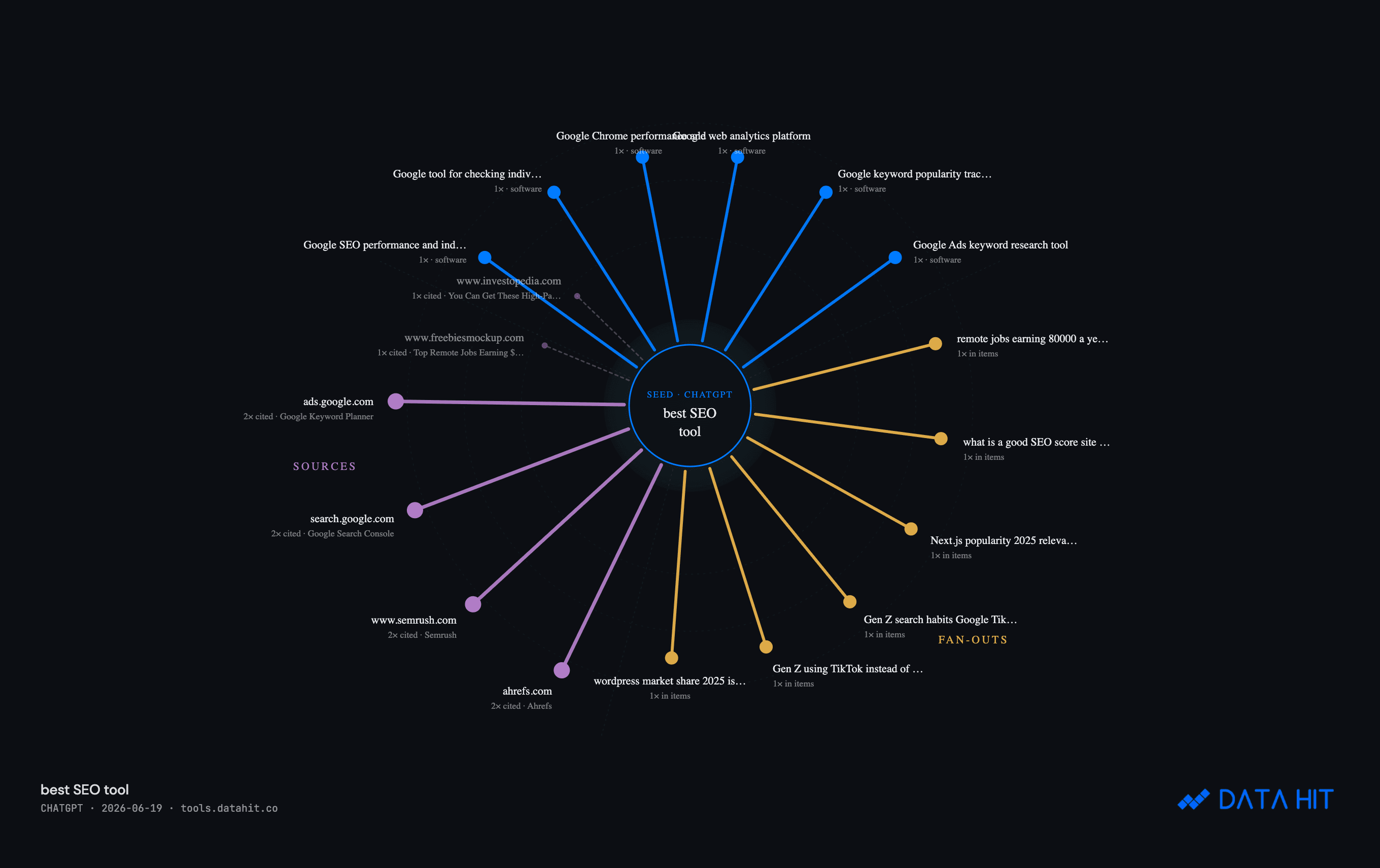
I scanned "best SEO tool" and it analysed 20 ChatGPT answers, surfacing 38 distinct brands and 77 unique cited sources. The detail I didn't expect: it explicitly checks whether your domain is cited, and if not, it tells you, "uneed.best is not cited in this answer," with a link to see who got cited instead. In an era where AI engines are increasingly the front door to your category, knowing whether you even appear (and who you're losing to) is becoming essential.
Pro Features & Benefits
The free tier is generous: Spiral, Grid, and SERP Map are unlimited with no login, and AI Monitor gives you a free sample preview. Pro is about turning a one-time look into a monitored asset, and it layers in some genuinely strong features:
- AI overviews across the tools. Instead of reading the charts yourself, Pro generates a written narrative. For my "best SEO tool" scan it produced a sharp paragraph noting that Ahrefs and Semrush split the spotlight but that Screaming Frog's crawler earned as many citations as Semrush itself despite being a niche utility, the kind of insight that would've taken me a while to spot manually.
- Search Console rank overlay on the SERP Seasonality Map, so you can see your own ranking history laid over the competitive picture.
- Tracked keywords with weekly snapshots, so the SERP and AI views become an ongoing monitor rather than a one-off.
- Saved dashboards / presets that store a chart's keyword, dates, and filters for one-click reload, plus filters by source, device, landing page, and channel.
- Annotations (right-click any cell to log a launch or campaign change), delta-vs-prior-period display modes, secondary metric layering, and CSV / PNG / SVG exports including an "Export Ads CSV" from the Timing Grid.
- A weekly digest so the monitoring comes to your inbox.
Pricing & Plans
DATA HIT keeps pricing refreshingly simple, and one subscription covers every tool across both pillars.
- Free: Seasonal Spiral, Timing Grid, and SERP Seasonality Map, unlimited, no login. AI Mention Monitor as a sample preview.
- Pro Solo, £19/mo: for in-house SEOs and solo operators tracking one site. 50 AI Mention scans/month, 1 GA4 / Search Console property, 20 tracked keywords with weekly snapshots, 5 saved dashboards per tool, weekly digest, and CSV / PNG / SVG exports.
- Pro Agency, £49/mo: for agencies and consultancies running multiple client sites. 250 AI Mention scans/month, 10 properties, 200 tracked keywords, 50 saved dashboards per tool plus client workspaces, and multi-user (up to 5 seats, coming Q4 2026).
Both Pro tiers come with a 14-day trial and you can cancel anytime, so you can monitor a real keyword set for a fortnight before paying.
Who Should Use DATA HIT Tools?
It's a strong fit if you are:
- An analyst or SEO who already knows the headline numbers and wants to see the shape behind them: seasonality, weekly rhythm, year-on-year drift.
- A media buyer or outbound rep who needs to know the exact hours worth targeting.
- An in-house SEO or consultant tracking how durable a competitor's rankings are, or whether your brand shows up in ChatGPT and Google AI Overviews.
It's probably less essential if all you need is a single headline KPI. These tools are about pattern and context, not a number on a card. But for anyone whose job is to interpret data rather than just report it, the visual angle does real work.
Conclusion
That's the end of this DATA HIT Tools review. What I appreciate most is that the suite has a clear point of view: dashboards are good at the what, and these tools are built for the pattern. The spirals and the heatmap aren't novelty. They genuinely surface things a line chart hides, and the SERP and AI tools answer questions that are only getting more important.
The easiest way in is to try it free: run the SERP Seasonality Map on a keyword you care about, or scan your own brand in the AI Mention Monitor, with no sign-up at all. If it shows you something your usual reports never did, the Pro tier is what turns that one-off look into ongoing monitoring.
What I liked:
- A genuinely original visual angle (the spiral) that exposes seasonality and weekly rhythm clearly.
- Three of four tools work instantly, free, with no login.
- AI Mention Monitor answers the increasingly vital "do I show up in AI answers?" question.
- Privacy-first: your raw data stays in your browser.
- Pro AI overviews turn the charts into written, citable insights.
Things to keep in mind:
- The deepest value is in connecting your own GA4 / Search Console data, which takes a few setup steps.
- It's a tool for people who interpret data, not a replacement for a headline-metrics dashboard.
- Multi-user seats on the Agency plan are still listed as coming later in 2026.
If your work lives in the patterns rather than the totals, DATA HIT Tools is well worth a look.
Related Articles

Reviews
Context.dev Review - One API for Scraping, Logos & Brand Data
We've tested Context.dev, a unified Scraping API, Logo API and Brand API that turns any domain into structured, AI-ready data. Markdown crawling for LLMs and RAG, a Clearbit-style Logo Link, and a full Brand API to personalize SaaS onboarding.